Wayotron Action
Robotic game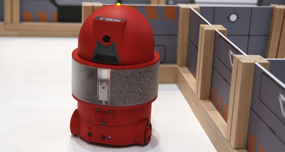
Overview
In Wayotron Action, players compete in a game with laser shooting robots. Elements from video games are combined with real robots that are controlled with tablets. The game made it to a playable prototype that was exhibited at several fairs.
The Challenge
A combination of digital games and real robotsWhen I joined the team at Tribotronik (now Wayotec), there already existed a first prototype of a laser shooting robot that was controlled with an app. However, the gaming part was just being started. Game mechanics needed to be defined. The app needed new features for setting up and playing games. And the development of all hardware and software components needed to be coordinated to achieve a consistent playing experience.
My Role
Game design, design of playing fields, creating mockups for the app to do the game setup and control the robot, conducting usability tests, playtesting, project management.
Optimizing the Controls for Gaming
Usability Testing
At first I had a look at the already existing controls and did some usability testing with colleagues who hadn't tried out the robot yet. I observed them often missing the buttons when they were not looking at the tablet. They also did not know how to hold the tablet to reach the buttons for moving the robot in a convenient way and had difficulty understanding some of the icons.
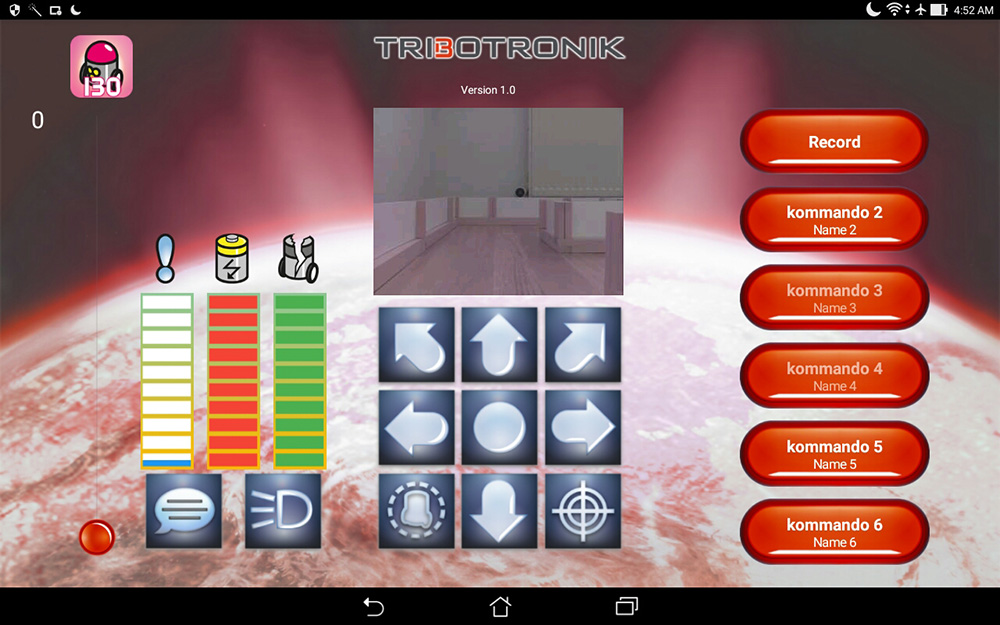
first version of the controls
Research and Iteration
When using buttons on a touchscreen instead of tangible buttons, it's easy to miss them. However, there are numerous mobile games that deal with the same problem. So I played various games from racing to shooters to get some ideas for a better solution. Based on my learnings, I came up with a new organisation of the interface. I exchanged the movement buttons for a joystick (so at least you have to hit only one button). I also moved the most important buttons for playing to positions that are easy to reach when holding the tablet like a gamepad.
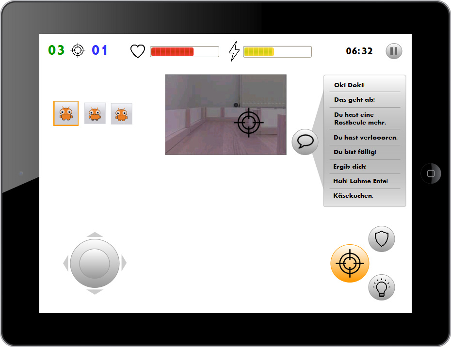
mockup of the new controls
Fine-tuning the joystick
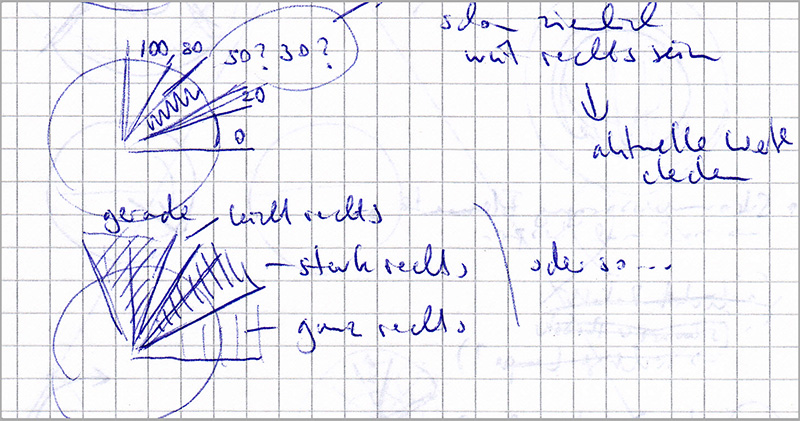
While the changes described above already solved some of the problems and made controlling the robot much easier, it still took some more time for us to get (mostly) satisfied with the controls. Aiming was still very hard because you couldn't do small movements. You also would often get stuck in small places because the robot's curve radius was very big.
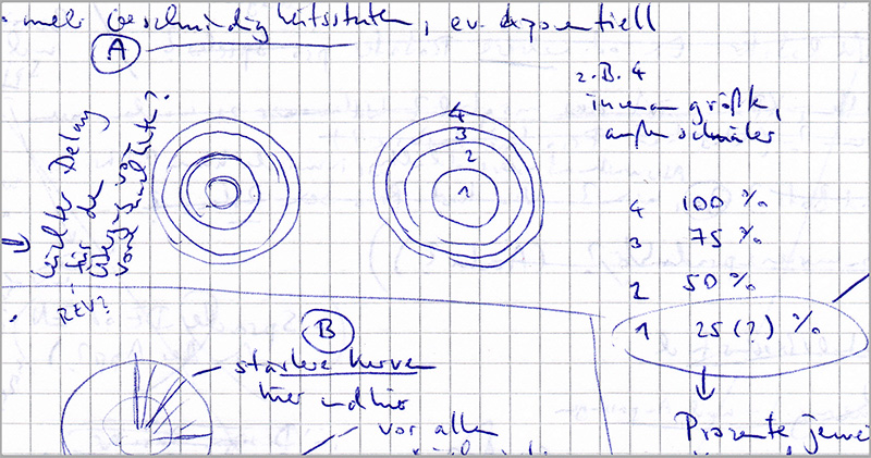
We had several people working on this and in the end I was also spending some time to fine-tune the joystick, e.g. adding a very slow speed for tiny movements and adding the possibility to turn on the spot. I also changed the behaviour of the joystick to avoid accidental slipping from forward movement to backward movement and vice versa. These adjustments were implemented in Java.
Creating the Game Setup
Sketching and Wireframes
When I joined the team, the app was consisting of only one screen: the controls. After looking at some multiplayer games, I developed a process for the game setup, starting with some quick sketches and then moving on to mockups.
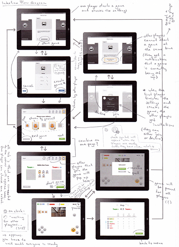
One player sets up the game, then each player chooses their robot and team. After the game, statistics are displayed. Mockups created in collaboration with our artist.
Usability Testing
After the mockups were finished, our artist started developing the graphical style for the interface. We also decided to conduct a first usability test with colleagues, family and friends (including some kids). We used a non-interactive prototype, showing our current screens to the users on a tablet and asking them what actions they would take.
In the version we tested, we had tried to put the robot and team selection on the same screen, so players could easily see all the important information before entering a game. This however was very confusing and the users tried to combine robots, players and teams in all sorts of ways and had trouble figuring out how it works. After testing several different options that all did not work well I suggested moving back to separating both screens, which solved the issue.

One of the earlier versions where choosing robot and team are combined on one screen and the final version with separated screens. Graphics created by our artist.
Specifications for Development
The mockups were also helpful when discussing with the developers how things should work on a technical level. After the discussion, I documented the results and created a sequence diagram about the communication between robots, tablets and the gaming server. This was then used to ensure all parts worked well together.

Taking the Hardware into Account
Apart from the app I was also constantly testing the hardware and we made usability adjustments there as well: in the first version of the robot, the laser was facing forward but was located slightly to one side. This made it hard to predict where exactly the laser would hit. I suggested centering the laser instead which made aiming easier.
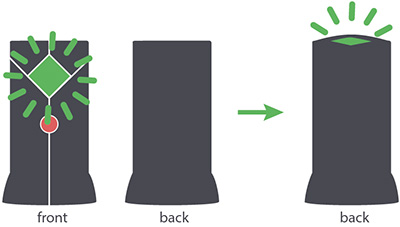
Some games also include flags that can be captured by shooting them. A successful capture is shown by a green light, which is located in the front of the flag. As this didn't allow players standing behind the flag to get that information, I suggested to additionally put a light on top of the flag so it's status would be visible from all directions.
Another element of the game is the so called charging station that restores the robot's health and energy (which is needed for shooting and a shield). Like the flag, it is recognised by the robot's camera through colour and shape detection when standing in front of it.
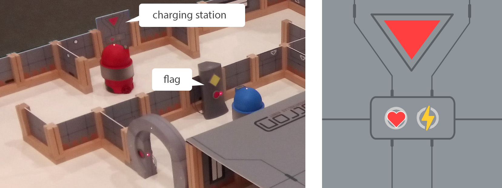
In the first version, the charging station was rather frustrating to use because the robot needed to be positioned very carefully and there was hardly any feedback telling the player if she had done it right. After discussing technical limitations and possibilities with the developer, I came up with the following solution: while the charging station was being recognised by the robot, the text "charging…" was flashing on the tablet directly underneath the camera image. Additionally, the robot was playing a sound. Compared to the first version where the increasing health points were the only feedback, this was an improvement that made using the charging station much easier.
Game Design and Playtesting
Parallel to the interface I was also working on game design. I created the underlying game mechanics as well as various weapons, abilities and items. I designed various game modes that involve things like capturing targets or protecting another robot, always keeping in mind the technical limitations of the hardware.
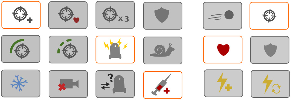
Not all of the features made it into the first prototype. However, I managed to do some playtesting and balancing of the basic features so we still ended up with a nice gaming experience.
Outlook
We completed a playable prototype of the game that was exhibited at several fairs but has not been developed into a final product. However, the robot itself continued to evolve and ended up being a more flexible robot that can be extended in various ways. For more details on the further development, have a look at this case study.
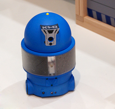
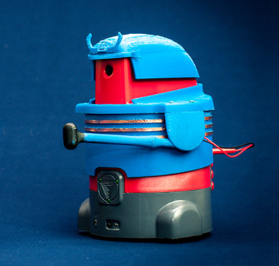
The game prototype and the new version of the robot with one of many possible extensions.